Studio Apartment Layout Ideas: The KEY to Choosing a Studio Setup That Flows Beautifully
This post contains affiliate links. If you click and purchase, I may receive a small commission at no extra cost to you. Thank you for your support!
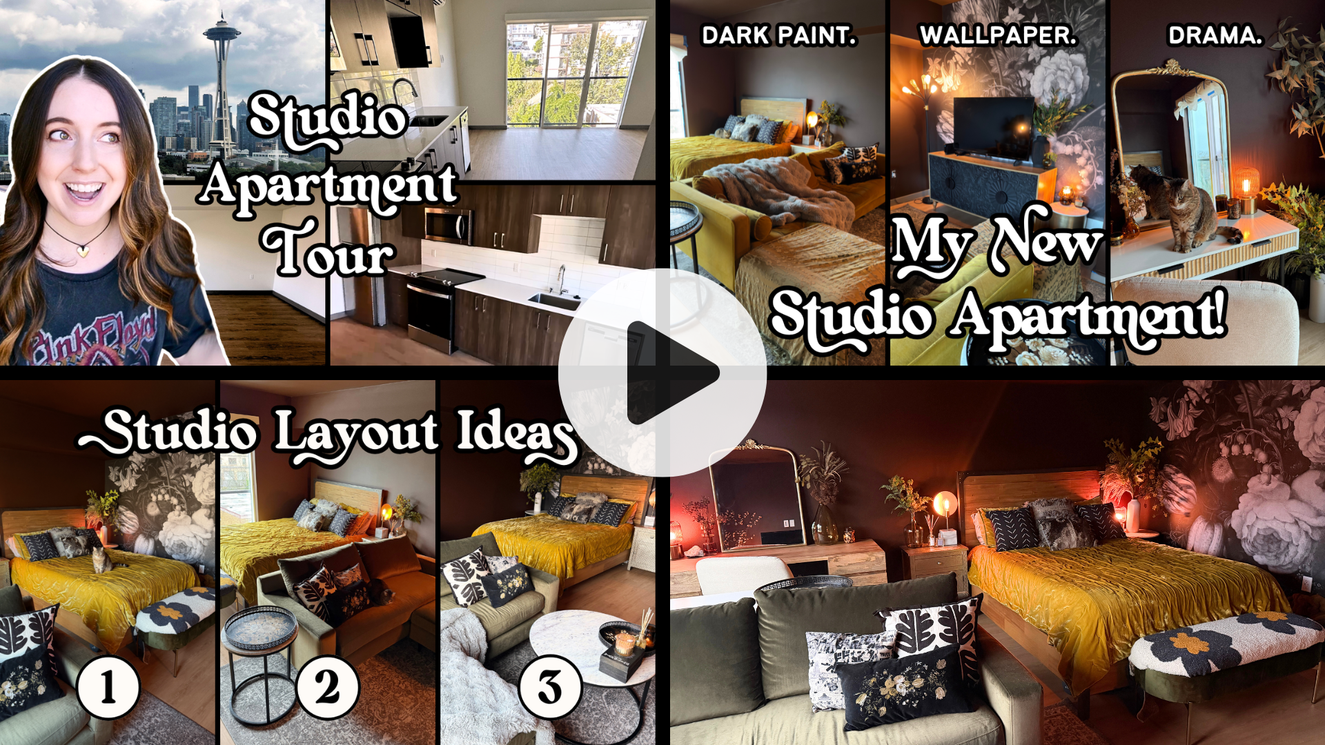
I moved into my 500 sq ft studio apartment a couple months ago, and since then I've tried 3 different furniture layouts. Which one did I choose and why??
If you live in a studio apartment - or any kind of small space - you know that figuring out your furniture layout can feel… dire.
Like, “Here’s my tiny empty box of an apartment, it’s a puzzle that doesn’t give you any hints or cheat codes, and now I just have to kind of stumble through, and I guess my couch should go here? …Is this ok?”
For such a small space, decorating a studio can be daunting.
So let’s figure out this game of furniture Tetris together!
And through this experiment of trying 3 different layouts in my own studio, I realized a KEY piece of the decorating process that you might not have considered. It’s something that’s so easy to overlook but so crucial when it comes to your apartment interior design. And I want to share it with you!
So if you want some inspiration and insight into the studio setup and styling process from someone who is currently in the thick of it, keep readingnd maybe you’ll get some ideas for your own space!
Would you rather watch than read? Here’s the video! ↓
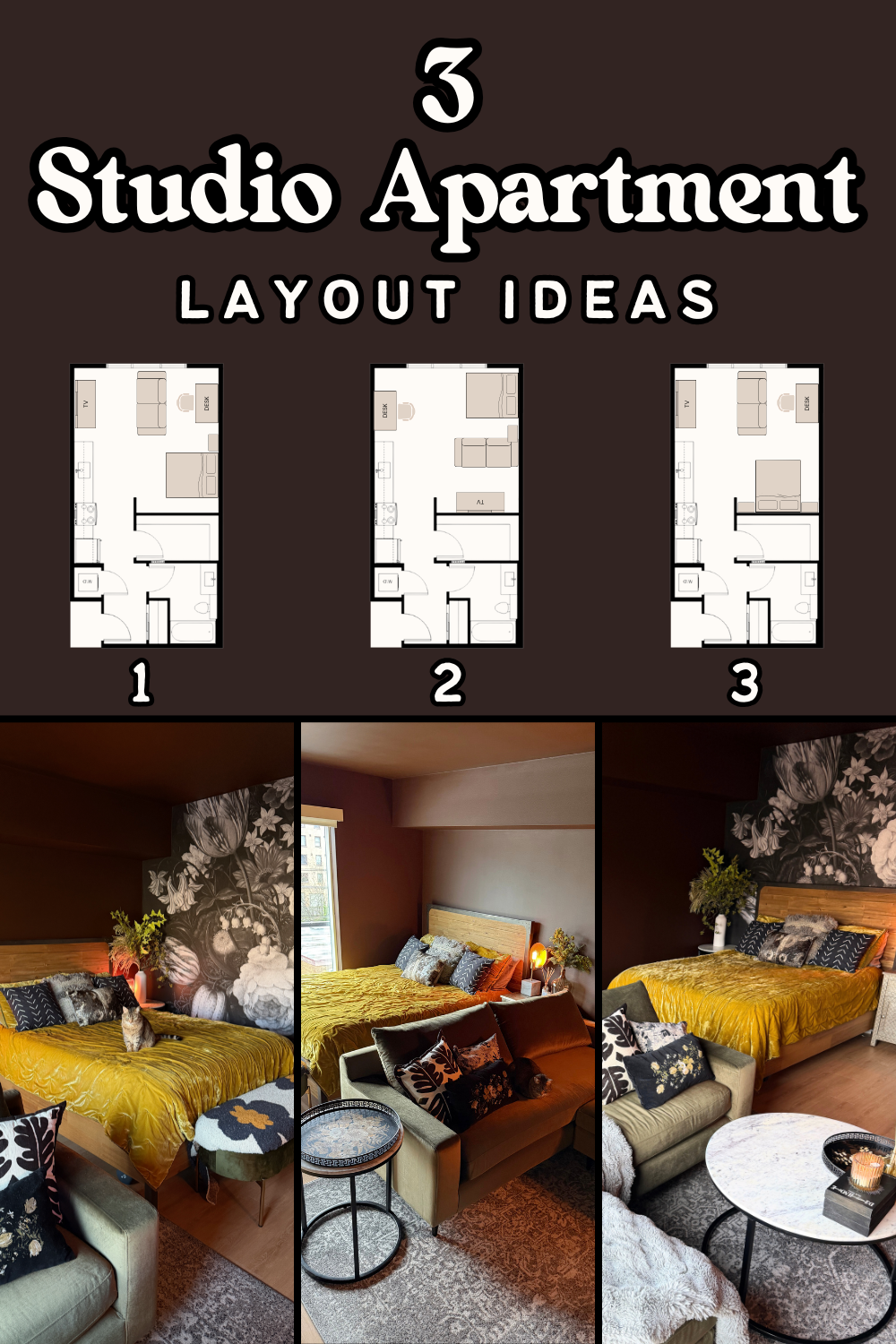
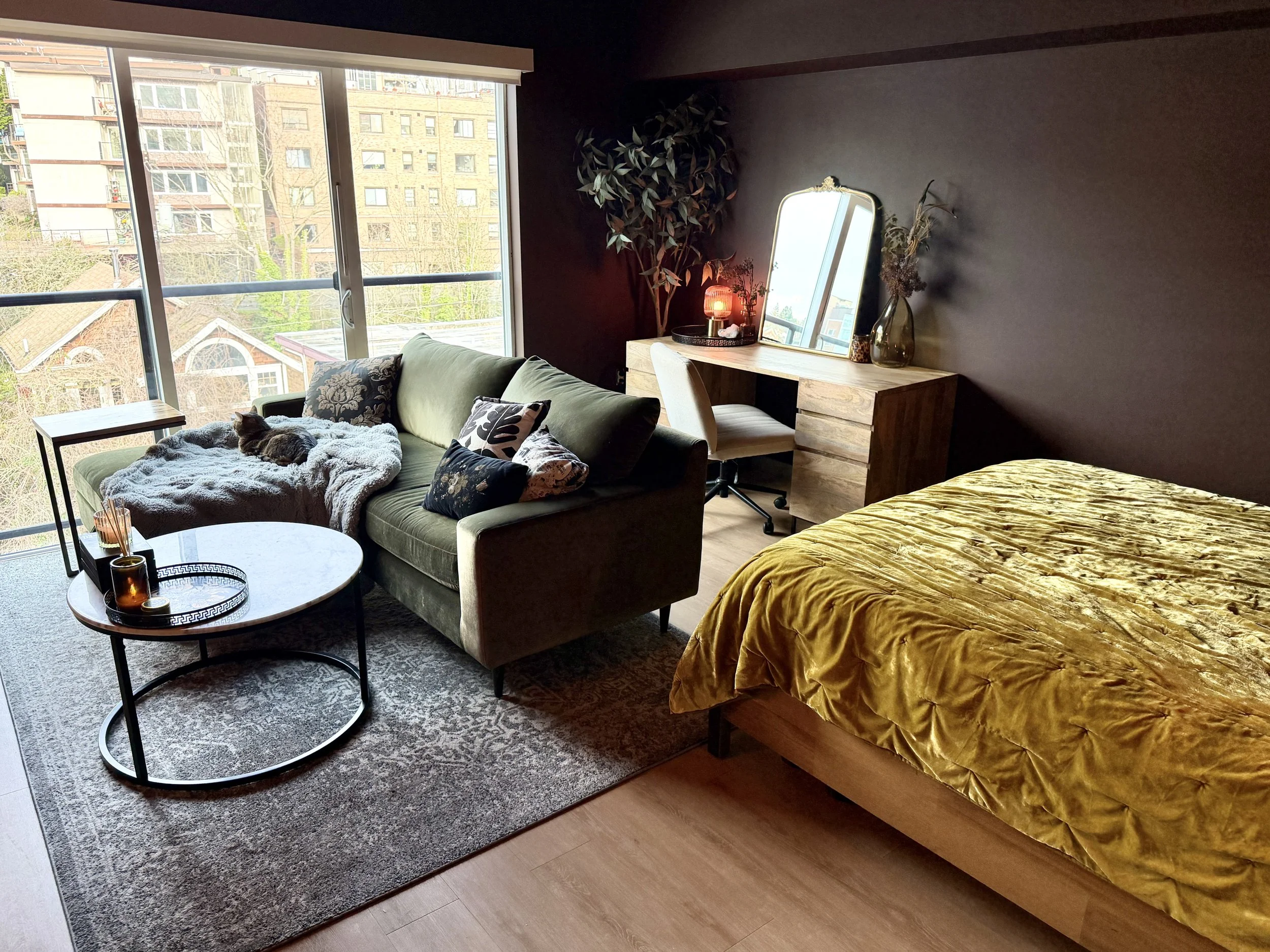
Studio Apartment Layout #1
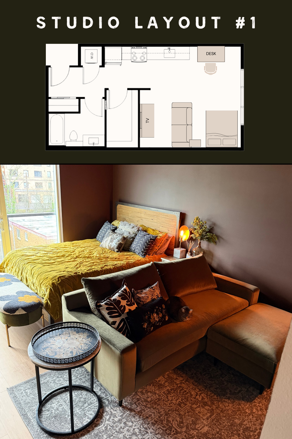
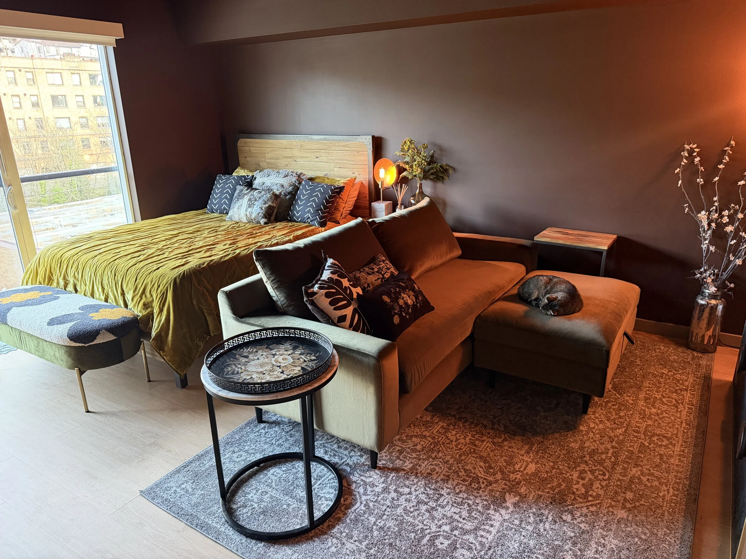
This layout is what I’ve called the couch divider layout, where the couch acts as a divider between the living room and the bedroom area. And I love this setup! It’s such a great configuration if you want a nice open yet subtly divided studio.
So, when it comes to this first layout, let’s talk about the pros.
For one thing, it feels nice and open and inviting. When I walk into a room, I like the furniture to be facing me, welcoming me into the space. See how the bed and couch are both facing forward and neither of them are turning their back to you? They’re welcoming you in with open arms.
This helps to create that elusive sense of flow we all want from a room and is especially difficult to achieve in a studio. Having two key pieces - the bed and the couch - facing you upon entering just makes things flow nicely. It feels like a complete picture this way without disruptions.
At the same time, there’s the sense of separation that we all want in our studios, which is usually something we have to create for ourselves. Because most studios are just empty squares that don’t come with any built-in separation. And I personally like the subtle separation the sofa creates here.
This is a great studio layout option for you if you don’t want to close up your space with physical dividers, and you instead want to embrace the openness of studio living - while still creating separate zones. And it’s the couch alone that does that here.
Overall, this layout just makes me feel good, mainly due to its intangible sense of flow and welcoming vibes.
Now, that being said, there are some cons with this layout - the main one being the shadow problem. Everything is backlit, especially the beautiful couch.
Having the furniture facing you when you walk in is great for making it feel welcoming, but in this particular studio - which is north facing and doesn’t get a lot of direct natural light - this means a lot of silhouettes. You can barely see what shade of green the couch is because it’s so dark.
Another con is the living room area in this layout is pretty cramped.
My coffee table that I had in my last apartment, which I will say is pretty large, won’t fit here. I mean, it could technically fit, but it would be pretty obtrusive and difficult to maneuver around. So, I’d have to sacrifice that for this layout. And coffee table aside, the cramped feeling of the living room area in this layout just is not ideal.
And the other con with this layout is the fact that the light that does come into this studio hits directly on the TV and makes it so I can’t see the screen.
That might not be important to a lot of you, but it is very important to me, as a television and gaming junkie. When I watch my shows or play video games, I want to see the screen!
And I do plan on getting curtains. But either way, I don’t want to have to close the curtains every time I watch TV or play video games because frankly, that is a huge chunk of my day. Not going to lie. 🙃
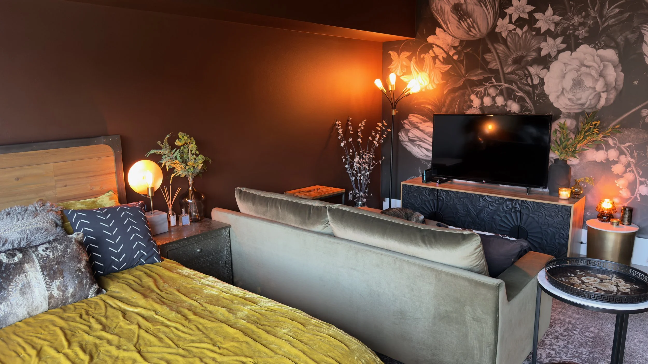
Studio Apartment Layout #2
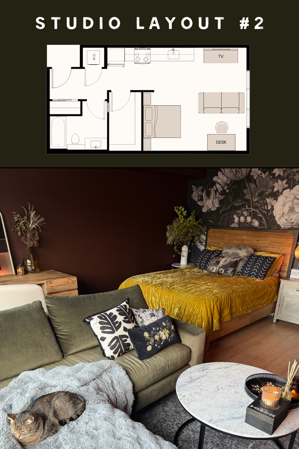
I really love this layout as well! It pretty much eliminates the dark silhouette problem the first layout has because everything is lit from the front or the side instead of from behind.
This just feels good, you know, being able to actually see everything. Go figure.
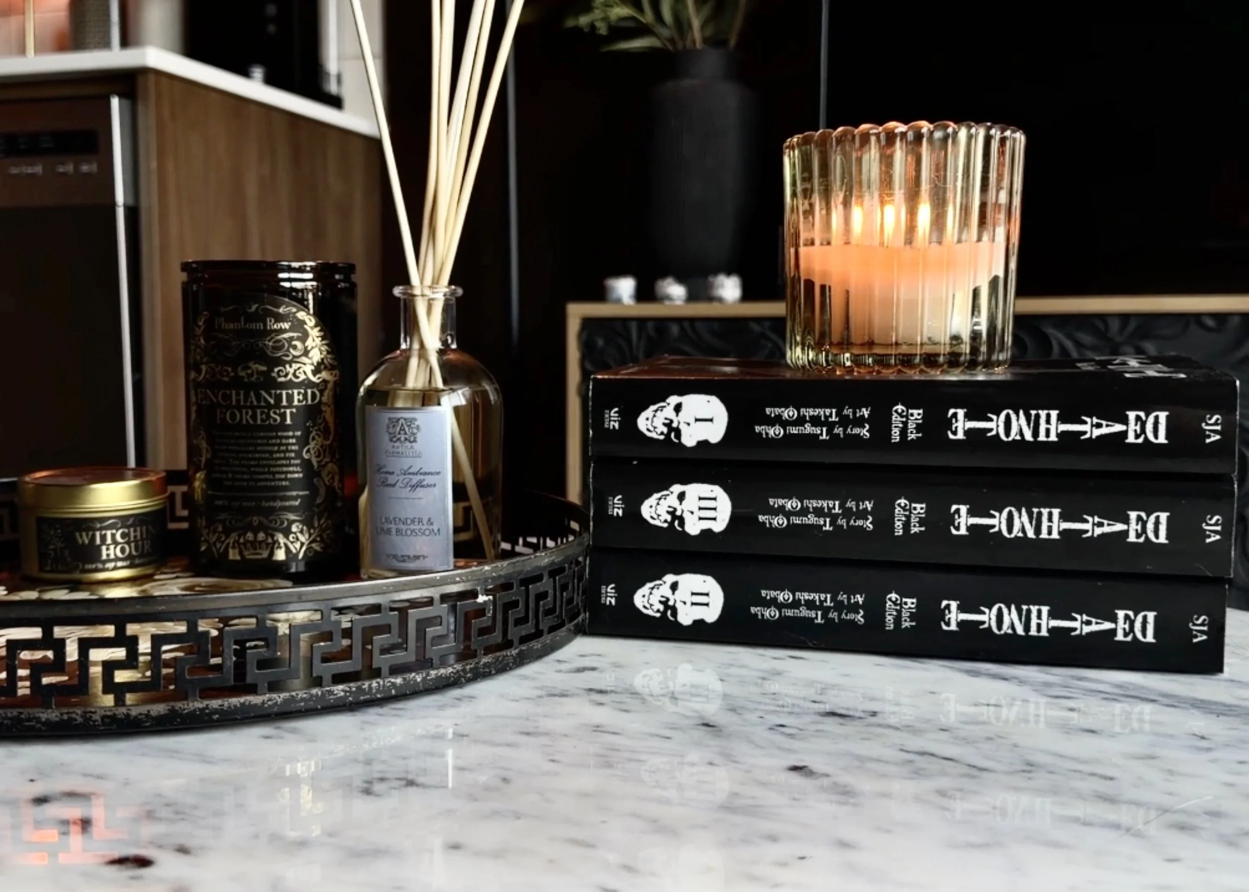
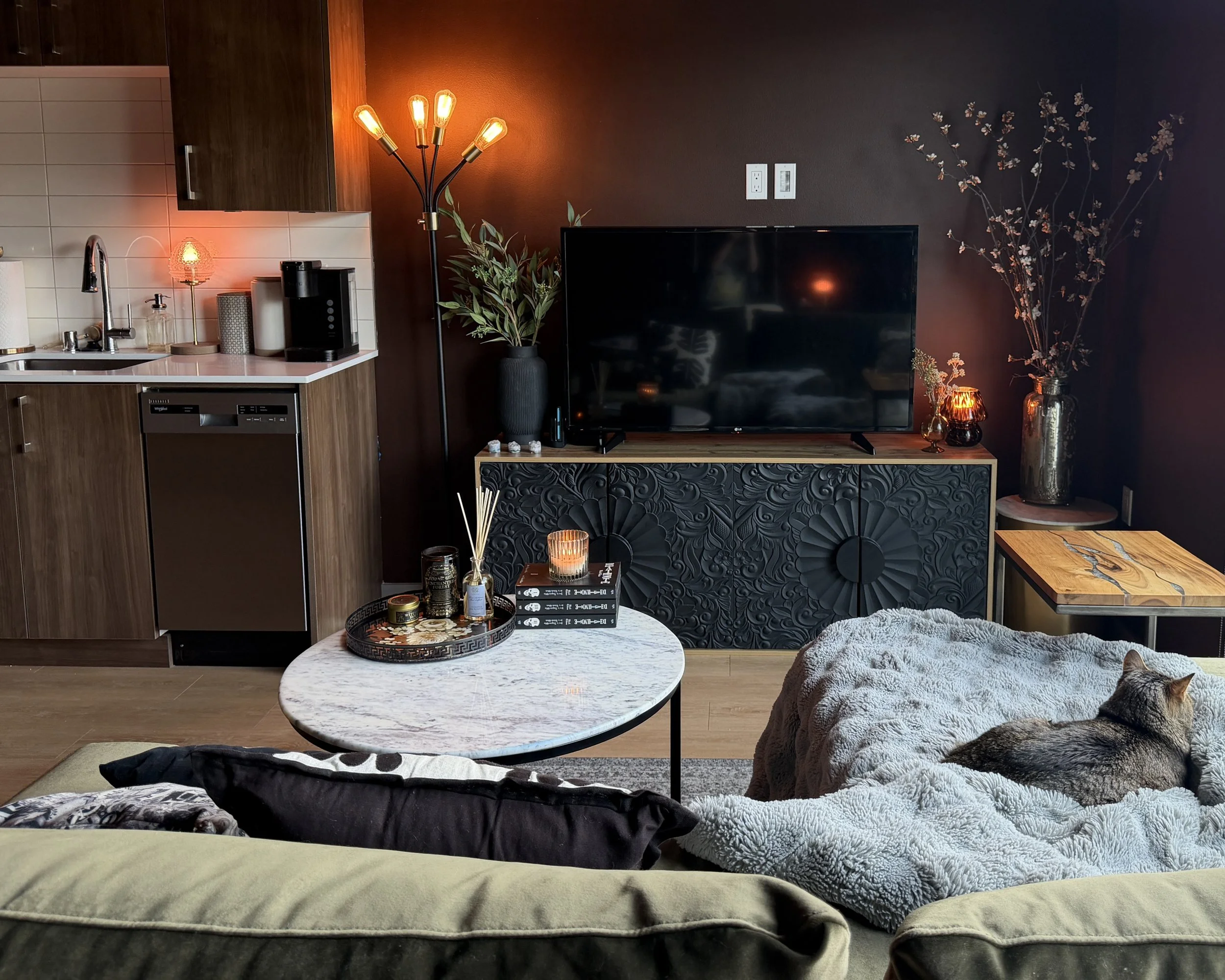
And with this layout, I get to have my coffee table back. That’s a pretty big deal to me, being able to have my Death Note manga centered styling arrangement back. If I can’t stare at a stack of Death Notebooks while waiting for the loading screen of whatever game I’m playing to finish up, then is my styling really complete? I don’t think so.
There’s definitely a lot more breathing room with this layout, which feels really lovely.
And when I’m sitting on the couch, it’s really nice to be right next to the window and to be able to actually take in the pretty trees outside and feel the cool fresh air right next to me when I have the door open rather than having my back turned to it all.
But speaking of having one’s back turned, this leads me to one of the cons of this layout: the bed’s back is turned to me when I walk into the room, which is not ideal.
Like I said earlier, I like the furniture in a room to face me and welcome me into the space. But in this layout, the bed is facing away. It kind of feels like an afterthought that you have to turn around to witness, and this makes the overall picture of the space feel a bit more disjointed than the first layout.
Does the bed in this position disrupt the big picture composition of the room too much? Maybe. I don’t know.
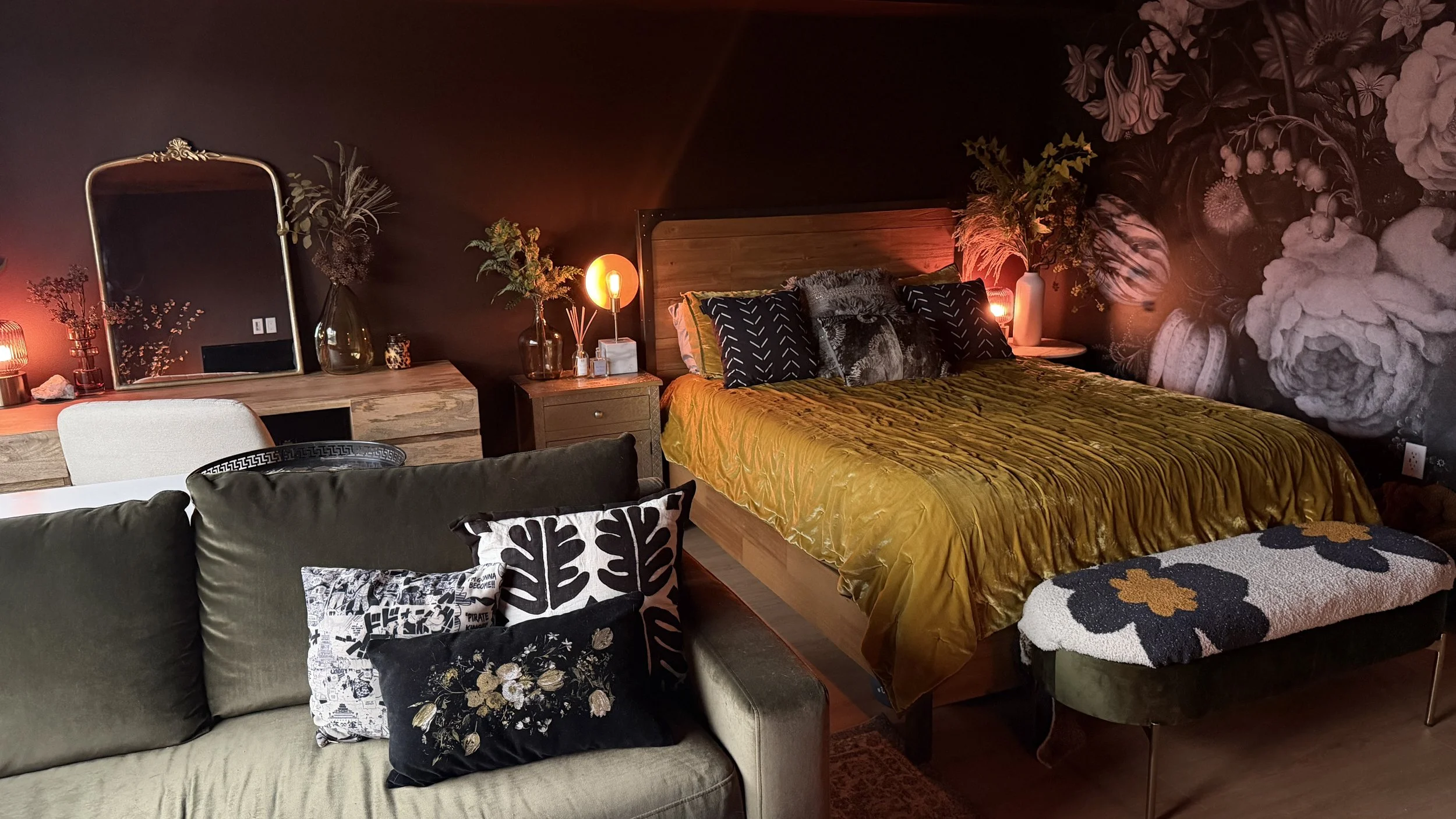
Now, I will say with this studio in particular, this doesn’t bother me as much as it would in other situations. When it comes to creating a sense of separation in a studio, it’s actually kind of nice for the bed to have its own little area. It’s almost like a little bed nook over here, which of course is inherently peak coziness.
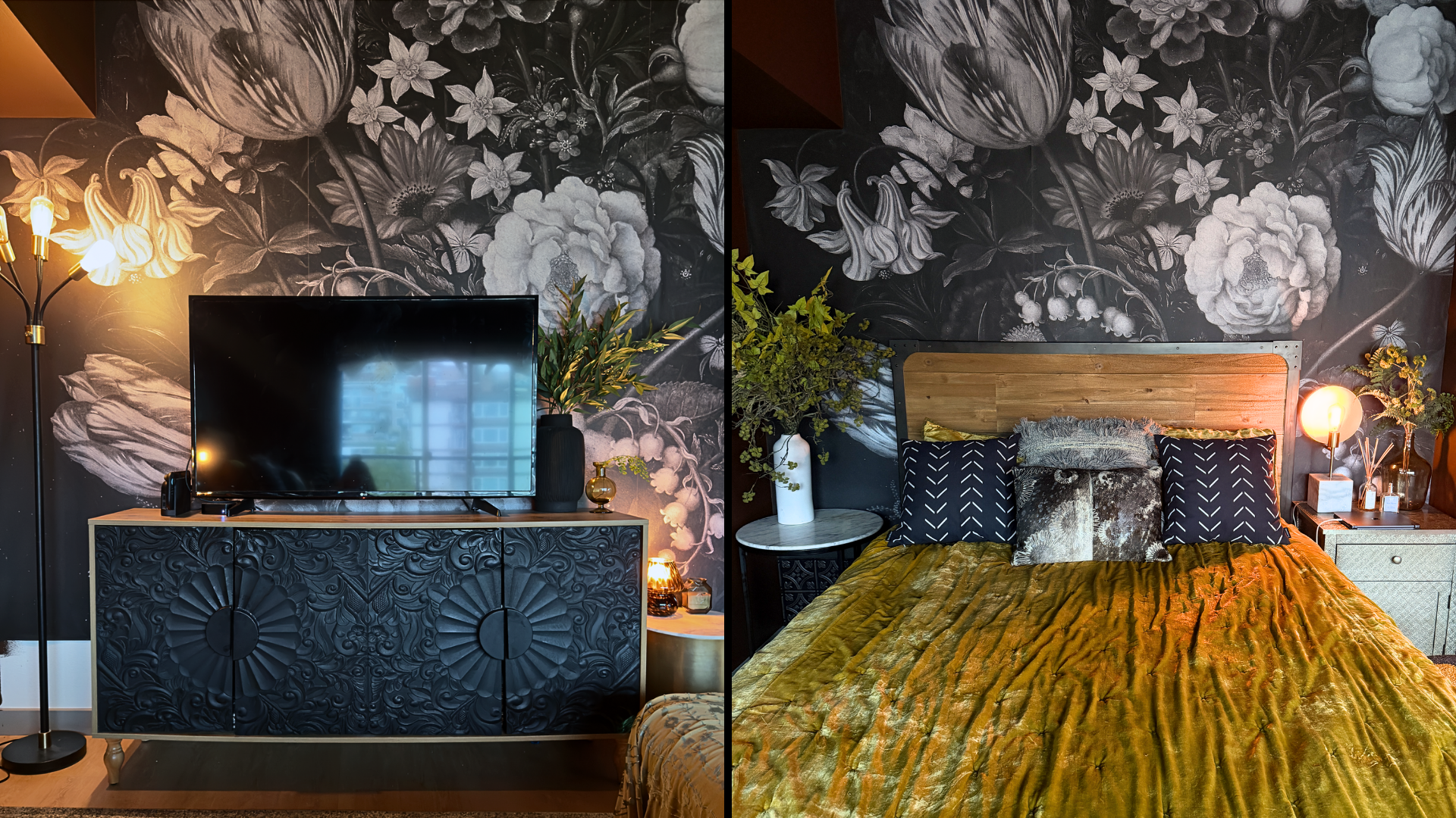
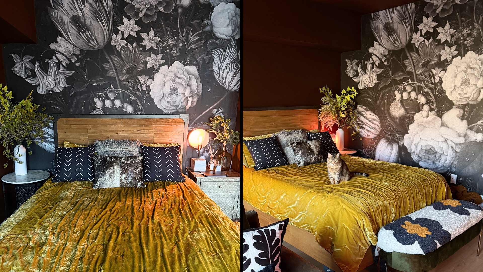
And having the bed against this wallpaper is gorgeous. The TV didn’t quite do this wallpaper justice the way the bed does. And on top of that, I don’t have to worry about the light glare on the TV screen with this layout!
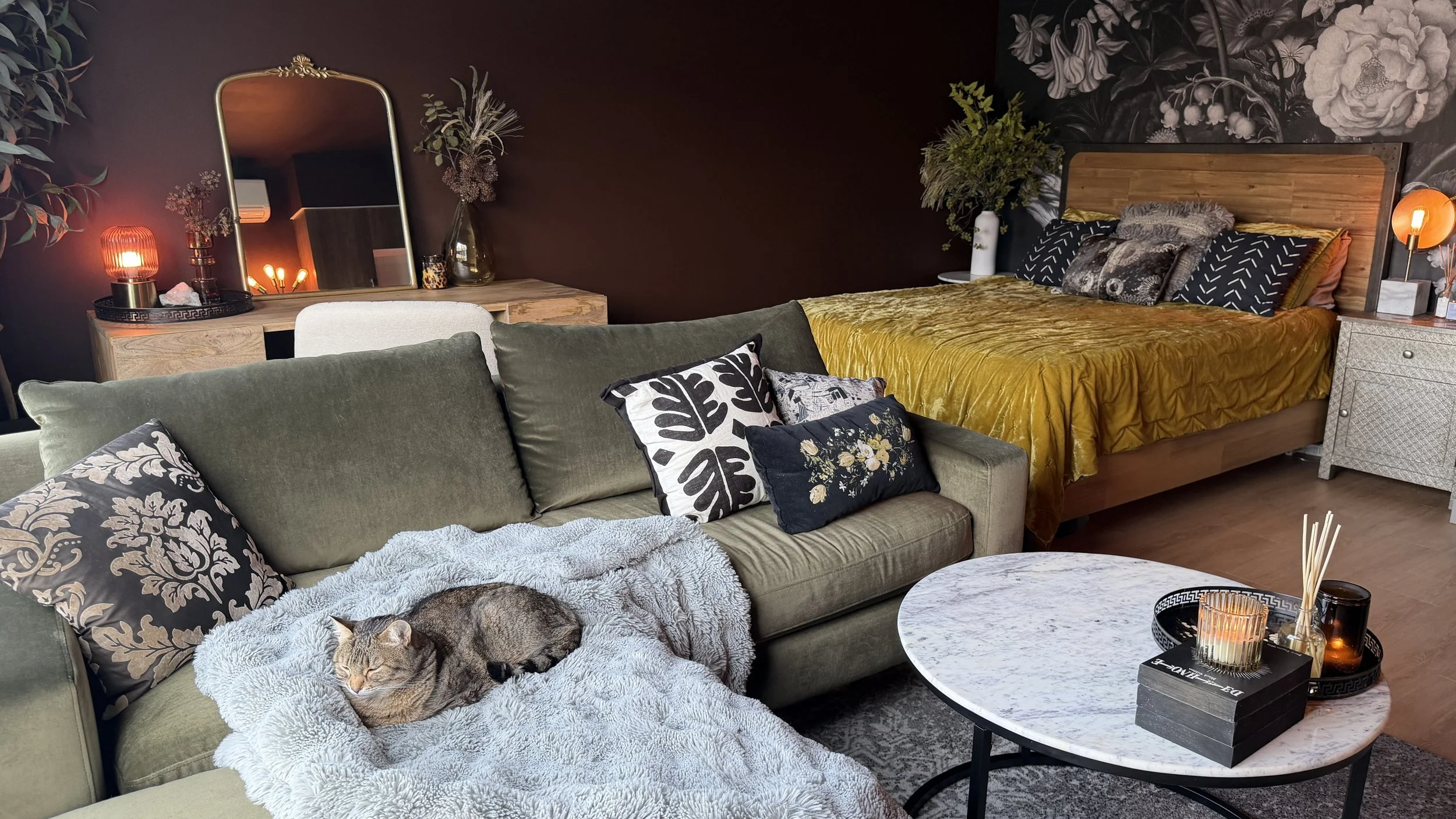
Studio Apartment Layout #3
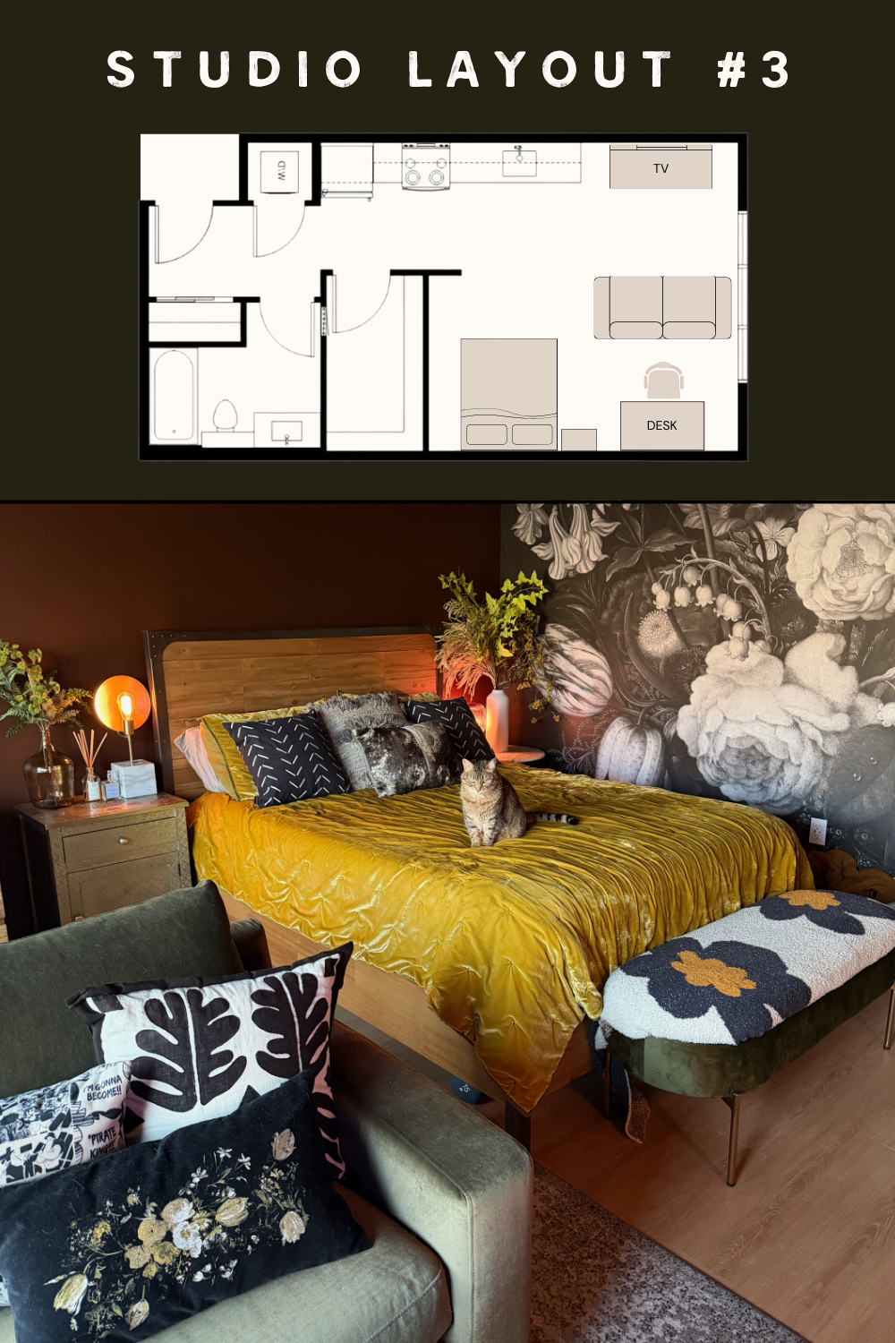
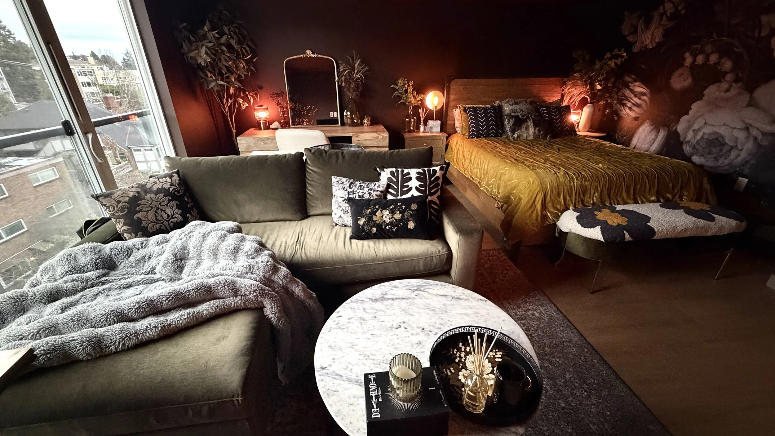
Now, let’s get into the third and final layout option, which is basically just layout number two, but with the bed rotated.
And you know what? I love this layout too! Mainly because in this configuration, the bed’s back isn’t turned to me. It no longer feels like an afterthought, and it doesn’t feel like a disruption to the space. It’s no longer jutting out from the abyss of my blind spot.
And since this is just about the same layout as the second one, minus the bed positioning, the same pros and cons pretty much apply here, except for anything having to do with the bed placement.
So light is still a major pro here, as nothing is backlit like it is in the first layout.
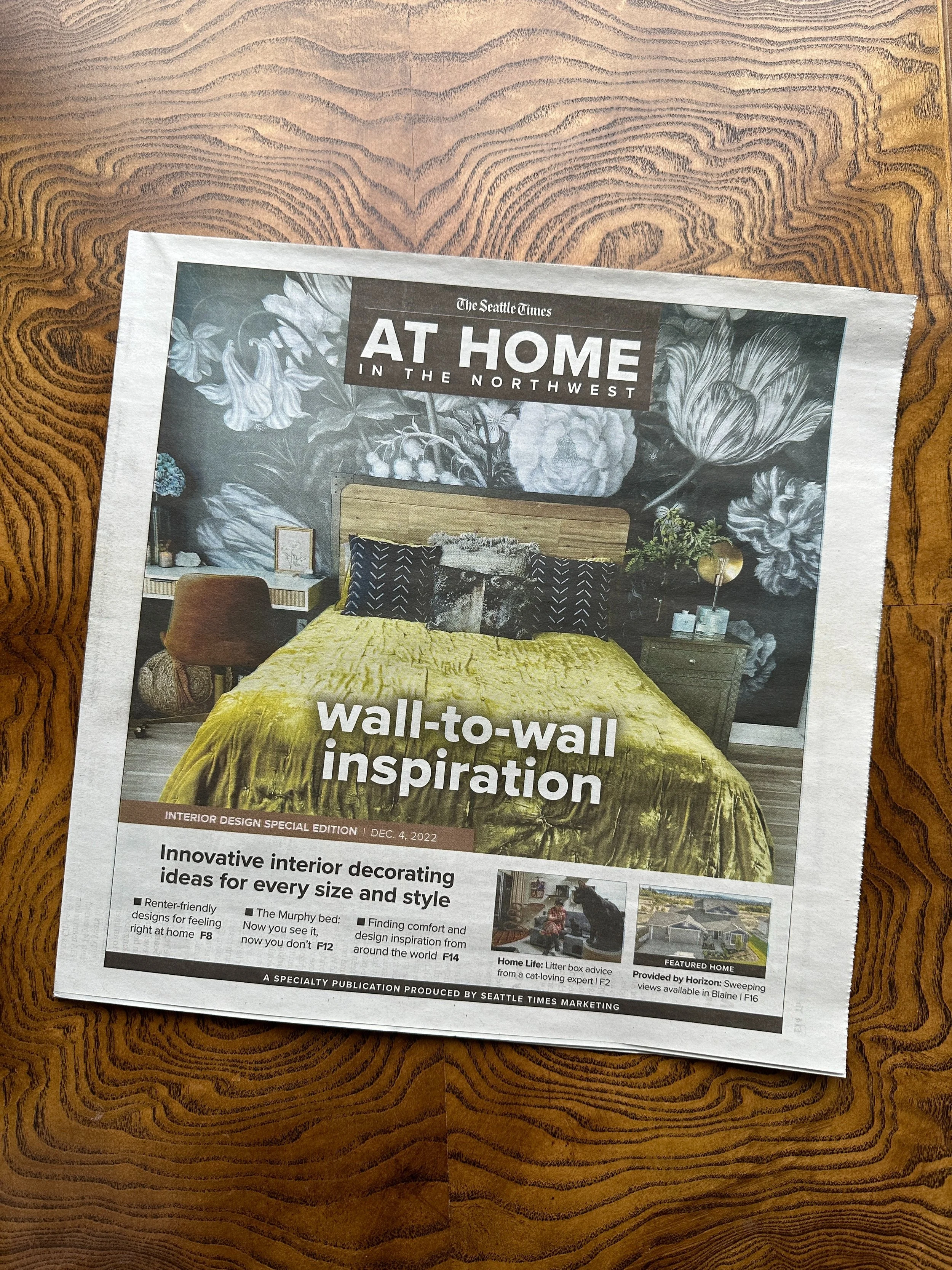
But a con with this layout is the bed doesn’t have the same stunning framing of the wallpaper as it does in layout #2. There’s just something about having the headboard against the wallpaper… it’s just so grand and dramatic, and I just love the composition. So did the Seattle Times, by the way. 😉
But that was a couple apartments ago, and every apartment has its own set of needs.
I will say, now the wallpaper statement wall feels a little untethered. It’s no longer anchored by a bed or a TV. So, does that bother me? I’m not sure.
Aside from that, when I walk into this layout, it feels really good. I do kind of get the sparkly feeling in my chest when I walk into this layout just because of how everything is playing off of each other in the big picture of the space.
This layout just kind of marries the best of both worlds from the first two layouts. The light hits this arrangement beautifully - no silhouettes. The overall flow feels great - no cold shoulders from any piece of furniture It just looks so pretty altogether as a cohesive composition.
Which Layout Did I Choose?
I chose…
Layout number three!
And here’s the main reason why. This is the key ingredient that I mentioned at the beginning of this video that massively tipped the scales in favor of layout number three. And you may have already guessed it: it’s light.
Light was everything when it came to choosing this layout. It was the key! Light prevailed over darkness. And yes, this would have applied to layout number two as well, but when you factor in just the overall composition and flow of this arrangement, it won out.
And with layout number one, good lighting is what it lacked. I didn’t want this studio to dwell in the shadows. And I know, as a lover of dark, moody styling, this may come as a surprise. But just because I’m a creature of darkness doesn’t mean I want everything literally in shadow. I want my dark style to be well lit!
No matter what your style is, lighting really is everything.
And in so many of my videos, I’ve harped on how important lighting is for styling a space and creating a a moody atmosphere. But I don’t think I’ve ever thought of it in terms of allowing light to actually determine how you arrange all the furniture. I’ve generally thought of lighting as a styling tool, not something that dictates furniture layout.
The things that I want to be lit well are no longer silhouetted. And the TV, the one thing I don’t want light to be bouncing off of, is now no longer in the spotlight it was in with the first layout.
So, when choosing a layout for your studio apartment, make sure you’re factoring light into it. How does the natural light in your studio behave? How does it hit the things in your apartment?
And lighting aside, the layout I went with simply feels good. But let me know in the comments which layout would you have chosen!
Also, keep in mind, this studio is not done yet. Now that I’ve chosen a layout, I feel like I can actually get the styling ball rolling. And of course, I will take you along with me as I continue to decorate!
If you want to catch up on what I’ve done in here so far, then check out this YouTube playlist of mine. It starts with an empty apartment tour of my studio and then just takes you through pretty much everything I’ve done up until this video. So, if you want to see everything that’s happened up until this point, give it a watch!